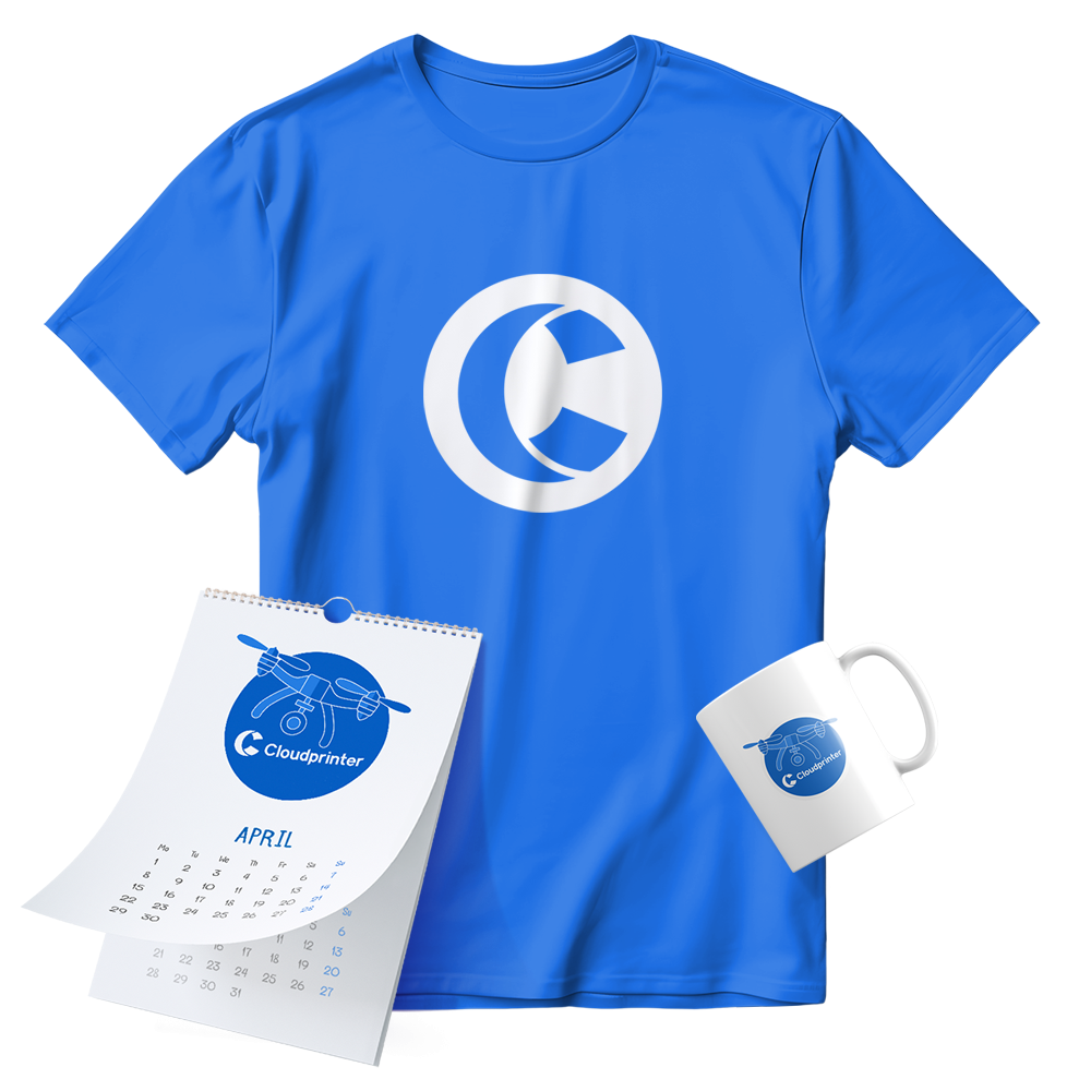
Our Brand Guidelines
Discover the proper assets to use when promoting, mentioning, or otherwise referencing our brand

Logotype
Safe Area
FOR LOGO ALIGNMENT
It is essential to preserve proportions and the safe area, the field that surrounds the logo, to ensure its aesthetic appearance. The minimum permissible margin around the logo must always be respected.
Cloudprinter Guidelines
Symbol
The symbol is a simplified image of our brand. It should fit into a rectangular or circle frame to be recognisable even in a very small size. This symbol will be used as an avatar on social networks in small sizes and for favicon.
Colours
The main corporate colour is Blue #0066f9. Corporate black #ff8401 is most often used for contours of graphic images and font. Additional colours can be used when creating corporate identity models. These include bright complementary colours.
Main Blue
CMYK 92 64 0 0
RGB 0 102 249
#0066f9
Blue Light
CMYK 55 34 0 0
RGB 122 162 255
#7AA2FF
Blue Dark
CMYK 100 93 27 13
RGB 14 17 123
#0E127B
Lime
CMYK 32 0 90 0
RGB 197 233 42
#C5E92A
Green
CMYK 81 36 100 31
RGB 50 98 16
#326210
Main Black
CMYK 0 0 0 100
RGB 11 57 27
#0B0F1B
Orange
CMYK 0 58 94 0
RGB 255 132 0
#FF8401
Brown
CMYK 28 91 100 33
RGB 140 41 0
#8C2900
Pink
CMYK 25 62 0 0
RGB 233 115 219
#E973DB
Violet
CMYK 74 100 20 8
RGB 102 20 110
#66146E
Corporate fonts
The corporate font is the font used in all corporate style media with a text component. Font along with other elements of the corporate style help to create the brand image.
If necessary, Nunito Sans can be replaced by Tahoma. For example, to create presentations in PowerPoint or structure emails.
Download Nunito Sans
Fixel
Display
+Nunito
Sans
A variable font with four axes: ascenders high, optical size, width and weight
These guidelines will help you correctly make use of our brand
This website uses cookies to ensure you get the best experience on our website. Learn more in our Privacy Notice